where y = mx + b is the best fit straight line for the set of data given by xrange and
yrange, and sem, seb are the respective standard errors, use the linest
command:
Highlight 2x2 cells,
type: =linest(yrange,xrange,i,1) <Ctrl-Shift-Enter>,
[for Mac's, either Command-Enter or Command-Shift-Enter, depending on
system]
where i = 0 to force b = 0, i = 1 otherwise,
xrange is the range of cells which contains the x-values, e.g. b3:b7.
For more detailed instructions, click on the link above.
Note: remember that the 90% confidence level is given by two times the standard
error.
Note: In addition to the linear fit statistics given by the above
step, be sure to show the best fit line on the graph by adding a trendline to
the graph. Always check that your trendline has the same equation as
your linear fit statistics give!
Excel 2003: Choose Tools - Data Analysis - Regression.
Excel 2007: Choose Data - Data Analysis - Regression (If DATA ANALYSIS is
not visible, you must install it using
these instructions)
Choose appropriate y- data and x- data.
Since we generally use 90% confidence intervals in this class, change the
confidence level to 90%.
Click ok.
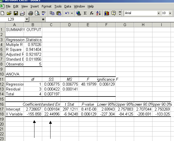
The output gives:

While we may be interested in the other things at times, we are generally
interested in deriving an answer from the fit. The slope ("X
Variable") and y- intercept are given, with one standard error for
each. From these, we can write the 90% confidence interval for the slope
and y- intercept of the fit.
- to graph data:
Note: if you have titles at the top of each column, highlight that too while
highlighting column data.
Highlight your column of x-values,
holding down <Ctrl>, highlight columns of y-values,
Hit the Chart Wizard button or from the menu, choose Insert, Chart, and choose
whether you want to put it on your spreadsheet, or on a new page.
The Chart Wizard will run:
Step 1: choose Next,
Step 2: choose XY (Scatter), Next,
Step 3: choose option 1 or 3, Next,
Step 4: choose Next,
Step 5: if you highlighted column titles, leave legend as yes, type in
graph, x-axis and y-axis titles, choose Finish.
- To add another set of data to your graph:
Highlight the column of y-values.
If the graph is inset:
point at the edge with your mouse,
drag (holding down right mouse button) and drop onto the graph (let go).
If the graph is on a chart sheet:
hit right mouse button while pointing at highlighted set and choose copy,
go to chart sheet and from the menu choose edit and paste.
- To edit graph, if it is surrounded by a regular black line, double click on it so
that it is surrounded by a heavy black line:
Data Graphed Incorrectly: If the x-values were not the furthest left
column, you will have to change the way the data was plotted. Double click on a data
point, choose Names and Values click in the Y Values box, and highlight the
correct y-values on the spreadsheet. Do the same for the x-values under the X Values
tab.
Editing Legend: To add or change a legend, double click on a data point, choose
the Names and Values tab and add or change the name (this can refer to a cell or be
text).
Change Graph Type: To change graph type, click on it with right mouse button,
choose chart type, and choose a new type.
Lines Connecting Points: To add or delete a line connecting points, double click
on a data point, under the Patterns tab, choose Automatic or None
under the Line option.
Editing Labels: To edit a title or axis label, single click the text on the plot
twice (not a fast double-click). Edit the text, clicking the mouse away from the
text when through.
Insert Labels or Gridlines: To insert a graph title, axes titles, or gridlines,
click on the graph with the right mouse button and choose appropriate option. Check
(click) appropriate check-boxes, hit okay, and then edit text if necessary (see Editing
Labels).
Hints for Printing: If the column widths are the standard (i.e., you
haven’t changed them; Excel’s standard is 8.43 wide), then only everything
through column I will print on a page, if you go past that to the right, then it will get
cut off and print on a second page. Shrink graphs which are not on a sheet of their own so
that they fit on a single page.
Switching Between Charts and Spreadsheets on Different Sheets: You can go back
and forth between graphs (plotted on their own sheet) and spreadsheets, or just between
different spreadsheets, by clicking on the tabs at the bottom of the page (e.g. Sheet1
or Chart1). So, e.g. you want to change the data plotted on a sheet on its own, Chart1,
double click the data point, then click on the spreadsheet tab, Sheet1, and choose
the correct spreadsheet column.
